Moots
Conceptual Brand Identity for a Community-First Social Media Platform
Project Type: Brand identity design, digital product branding
Timeline: 1 week
Status: Speculative / self-initiated
Deliverables: Logo system (primary and secondary marks), mascot design, app icon, typography system, color palette, poster-style promotional campaigns, branded merchandise concepts, and a scalable visual identity system designed for digital and social platforms
PROJECT OVERVEIW:
Moots is a self-initiated graphic design project developed as a conceptual brand identity for a fictional social media platform positioned as an alternative to Twitter/X, Threads, Bluesky, and Mastodon. The platform is centered on community, connection, and user autonomy. The name “Moots” is derived from internet slang for “mutuals,” establishing a playful, familiar brand voice aimed at younger, digitally native audiences.
PROBLEM:
Following Elon Musk’s acquisition of Twitter, users actively searched for alternative platforms. While several competitors emerged, many struggled to gain traction due to unclear brand direction and weak visual identity systems. Most alternatives relied heavily on functional similarity while failing to establish emotional attachment, clear differentiation, or recognizable brand presence during onboarding.
In a crowded ecosystem of near-identical platforms, visual identity became a primary factor influencing trust, recognition, and early user retention.
GOAL:
Establish immediate brand recognition and emotional approachability during early user adoption through a cohesive, distinct visual identity tailored to younger audiences.
TARGET AUDIENCE:
Moots is designed for younger, digitally native users who are scroll-heavy, news-driven, and accustomed to rapid content consumption. This audience has a low tolerance for friction and a high sensitivity to visual clarity, familiarity, and brand personality, particularly in mobile-first environments where attention is limited and competition is constant.
CONSTRAINTS:
Highly saturated market of Twitter alternatives
Need to differentiate without replicating Twitter’s visual language
One-week design timeline
Visual system required to function across mobile interfaces, social feeds, and promotional materials
Balance between news-driven content and casual social interaction
MY PROCESS
I began by researching competitor platforms such as Bluesky and Mastodon, focusing on branding, onboarding experience, and visual differentiation rather than feature parity. A consistent issue across platforms was the absence of a strong, recognizable visual anchor that could foster emotional attachment.
One of Twitter’s most successful branding elements prior to its rebrand was its mascot-driven identity. Rather than replicating this directly, I explored mascot concepts that could function symbolically and typographically.
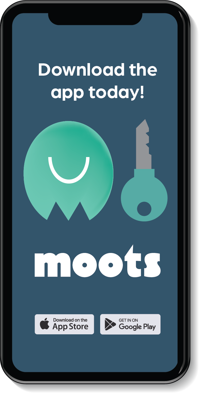
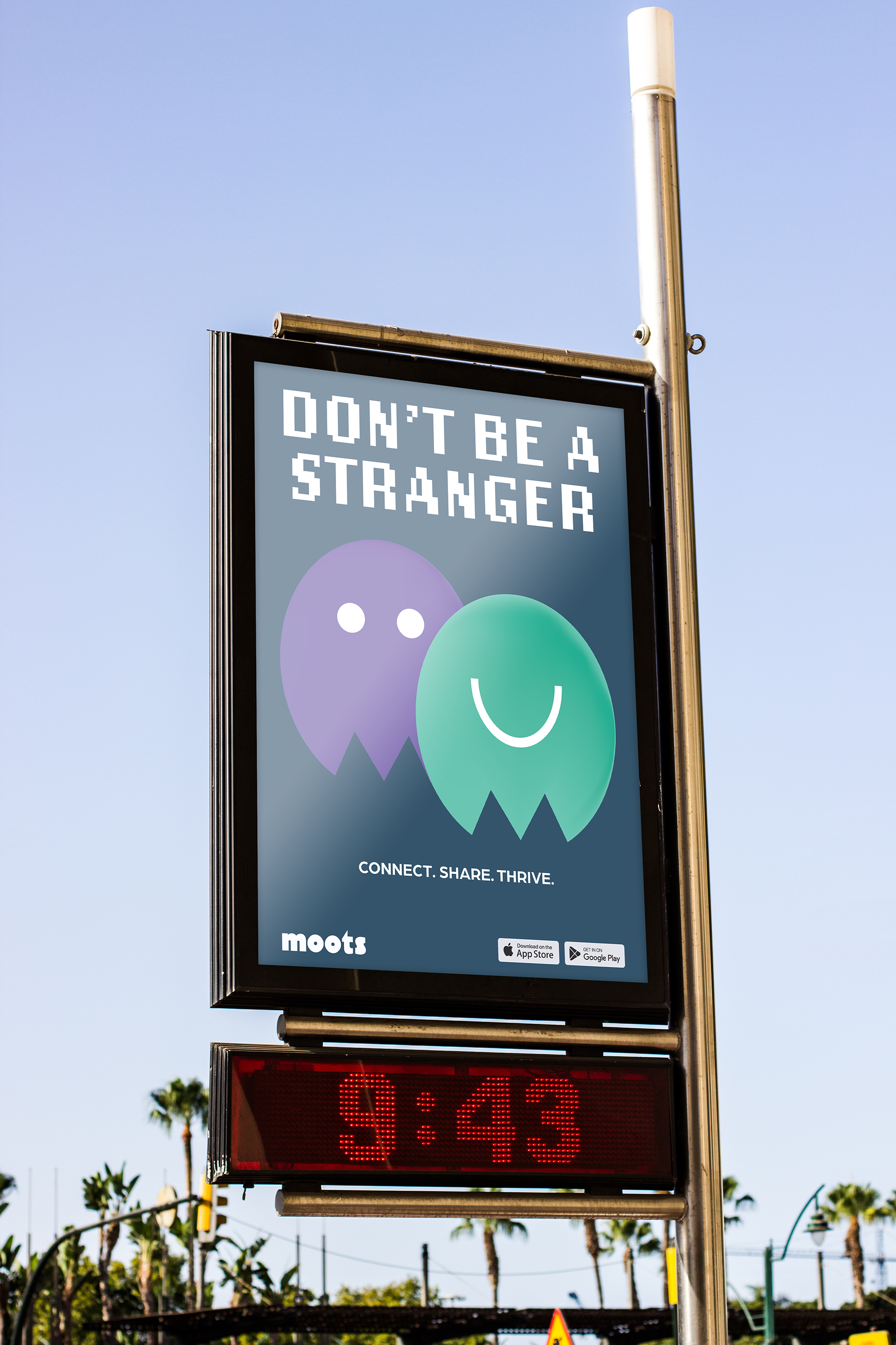
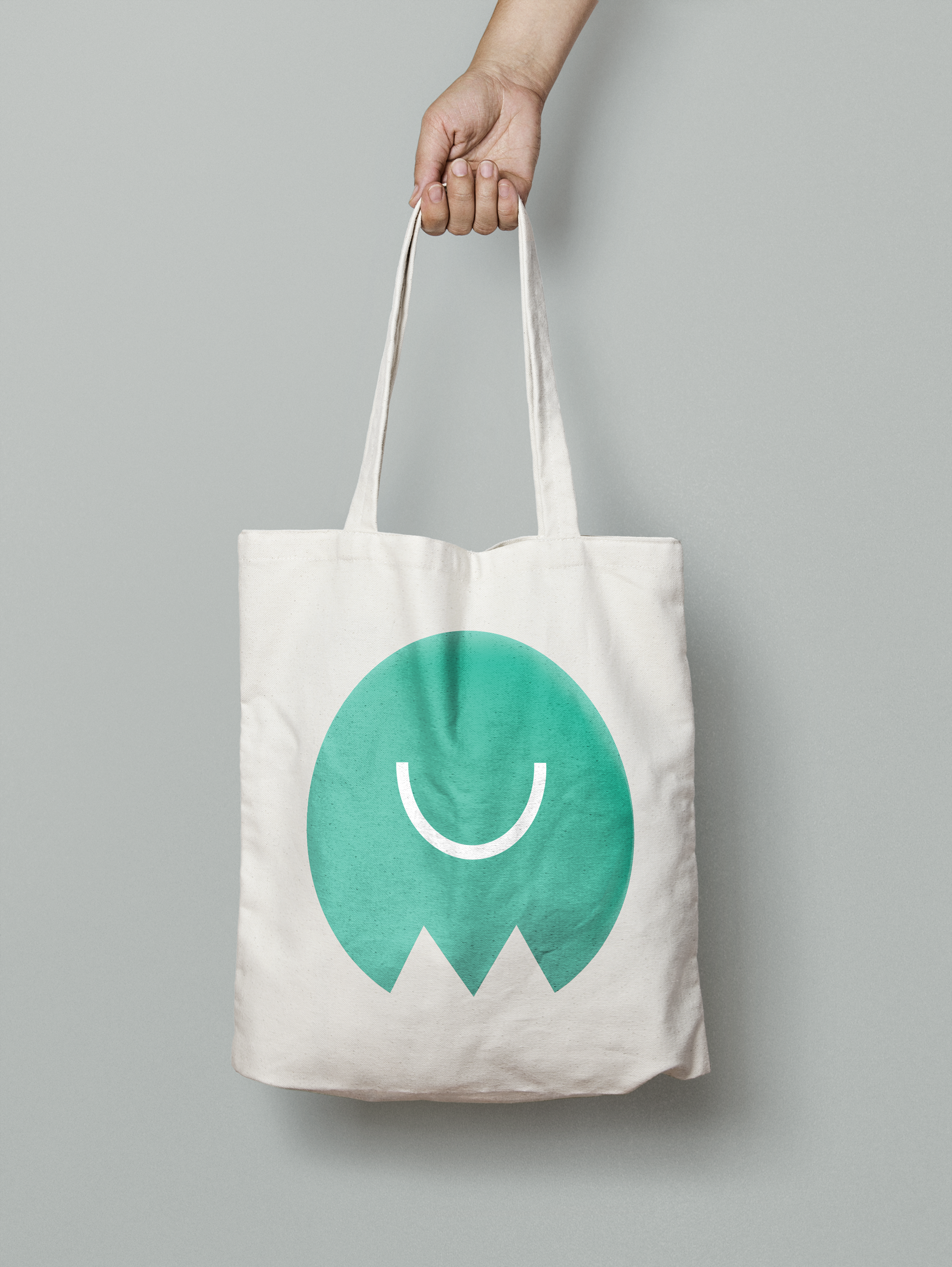
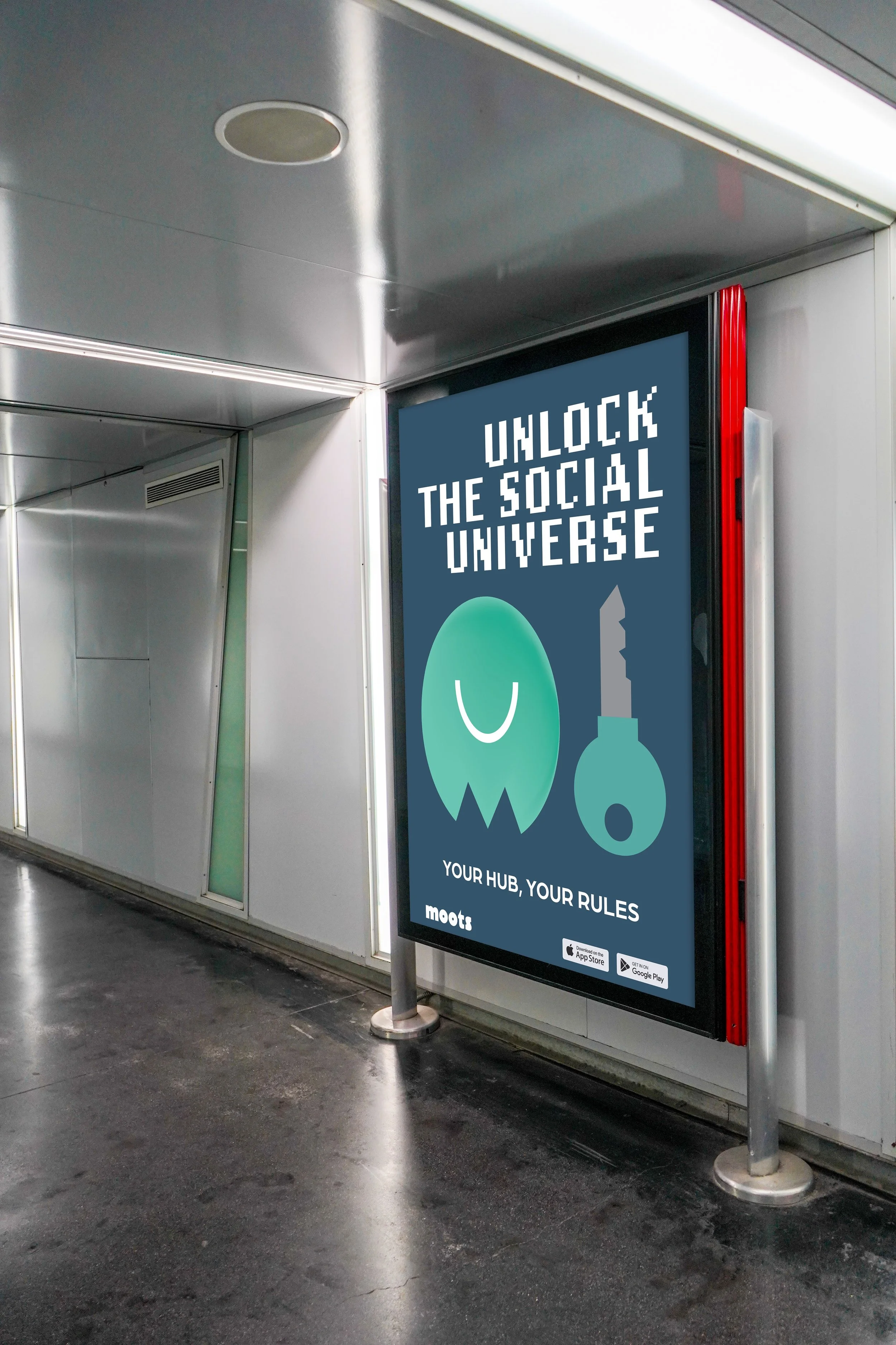
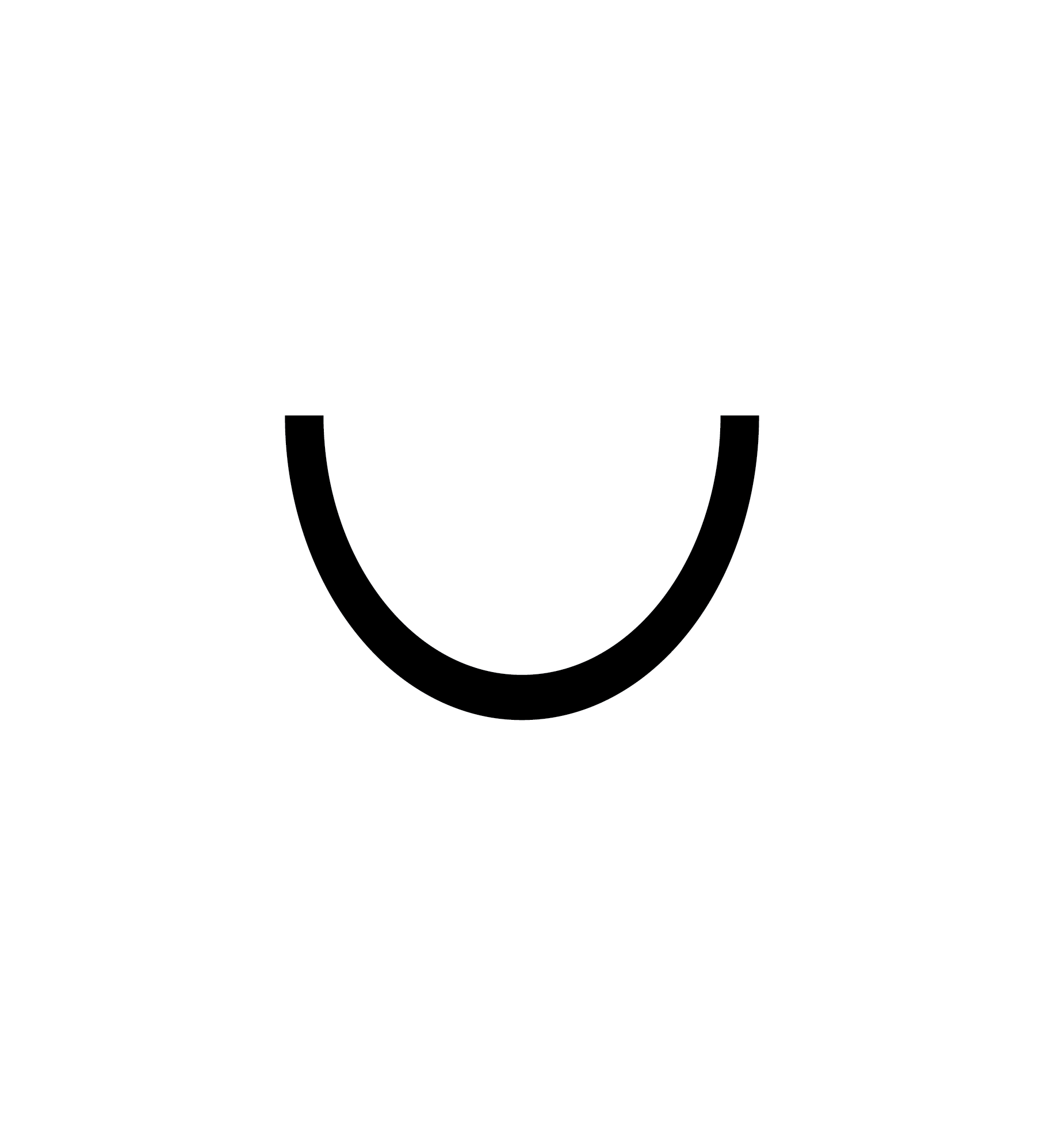
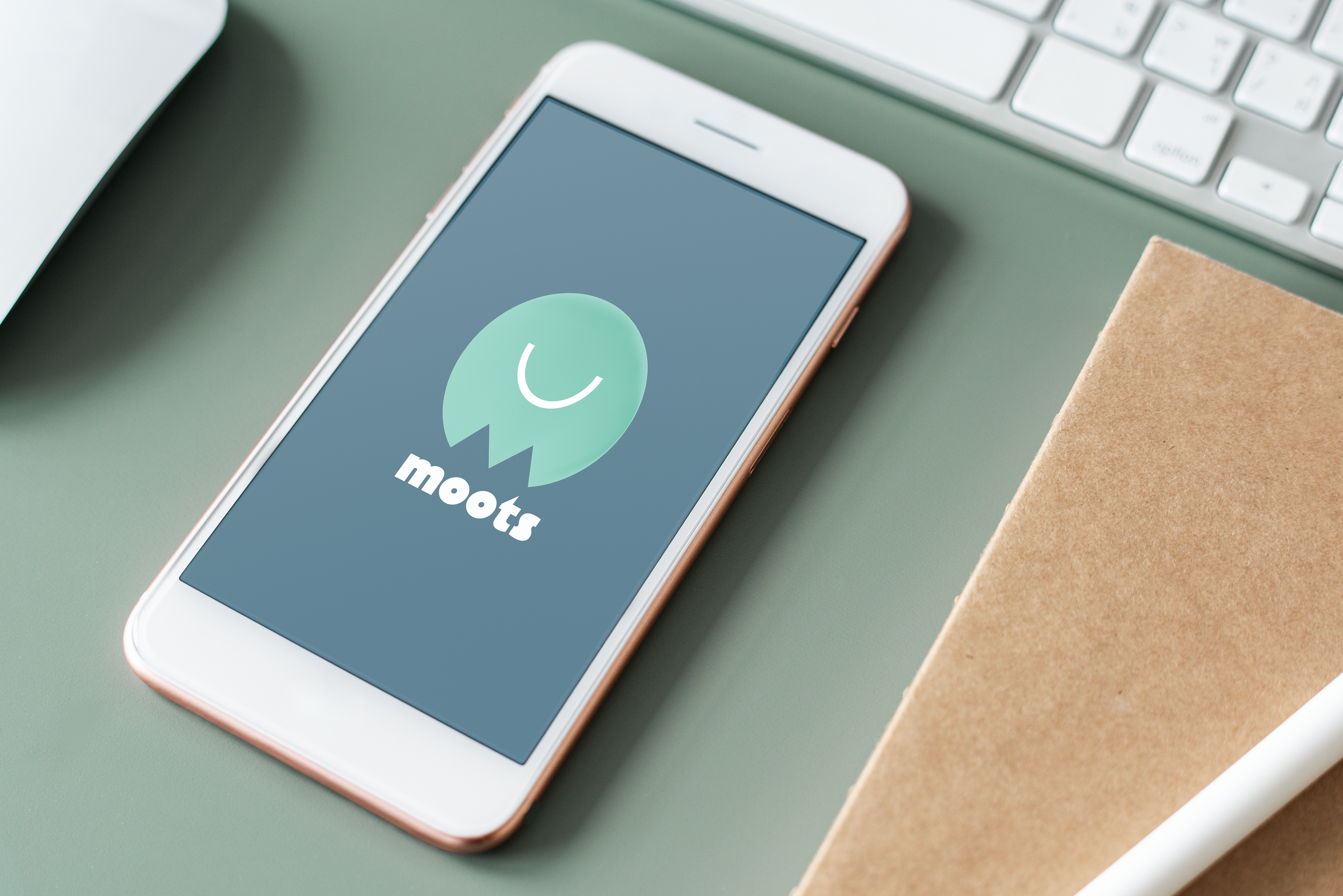
The final mascot takes the form of a simplified ghost constructed from rounded geometric shapes. The lower edges of the form intentionally mirror the letter “M,” directly referencing the name “Moots” while maintaining flexibility as both a character and a logomark. This allowed the mascot to operate simultaneously as a symbolic brand figure and a subtle typographic extension of the wordmark.
The ghost form also reinforces themes of presence, connection, and re-emergence within online communities, aligning naturally with the platform’s emphasis on mutuals and re-socialization. Supporting typography and layout decisions prioritized rounded forms, legibility, and low cognitive load to optimize the design for fast scrolling environments.


SOLUTION:
The final solution is a cohesive visual identity system built around a mascot that doubles as a symbolic “M” mark, supported by rounded geometric typography and a flexible color palette. The system is designed to be immediately recognizable, approachable, and scalable across digital and physical applications.
OUTCOME:
The identity is built for clarity and speed, designed to support early user adoption and improve retention during onboarding. By pairing a recognizable mascot with a subtle typographic reference to the platform’s name, the system reinforces brand recall while maintaining a playful, welcoming tone suited to scroll-heavy environments